Creating a Responsive HTML Email

Watch Creating a Responsive HTML Email

  • 2015
  • 1 Season

Creating a Responsive HTML Email is an engaging and informative show from Codify Design Studio that explores the creation and design of responsive emails. In today's digital world, email marketing is a crucial aspect of any business, and this show offers valuable insights into how to create responsive emails that will engage customers and drive sales.

The show is presented by a team of experienced email marketers and designers from Codify Design Studio who take viewers through the process of creating a responsive HTML email from start to finish. They cover everything from choosing the right platform to designing engaging email templates that work seamlessly across all devices.

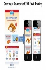
One of the key takeaways from the show is the importance of responsive design in email marketing. As more and more people access their emails on mobile devices, it's essential to ensure that email templates are designed with mobile users in mind. The team at Codify Design Studio provides valuable tips and examples of responsive email design, including best practices for incorporating images, typography, and color schemes to create visually appealing emails that capture attention and encourage engagement.

Viewers of the show also learn about the importance of testing and analytics in email marketing. The Codify Design Studio team emphasizes the need to test email templates across multiple devices and email clients to ensure that they look great and function properly for all users. They also cover how to use analytics tools to track open rates, click-through rates, and other key performance indicators that help businesses optimize their email marketing efforts.

In addition to providing practical tips and advice, Creating a Responsive HTML Email is an engaging show that keeps viewers entertained and informed throughout. The show features plenty of real-world examples and case studies, as well as interviews with industry experts who share their insights into the latest trends and best practices in email marketing.

Another key theme of the show is the importance of storytelling in email marketing. The Codify Design Studio team emphasizes the need to craft compelling copy and visuals that tell a story and create an emotional connection with customers. They provide examples of effective storytelling in email marketing, such as personalized messages that address customers by name and highlight their individual interests and needs.

Overall, Creating a Responsive HTML Email is an informative and engaging show that provides valuable insights and advice for businesses looking to improve their email marketing efforts. Whether you're a seasoned email marketer or just getting started, this show offers practical tips and strategies for creating responsive emails that engage customers and drive results.

Filter by Source
No sources available
Seasons
Where to go from here
32. Where to go from here
 
Remember to set expectations: HTML emails are not web pages and have limitations. Experiment and test combinations of HTML and CSS for alternate layouts. Find out more online from resources such as Campaign Monitor for tips and best practices.
Planning alternate layouts
31. Planning alternate layouts
 
So now that we've built this layout, you'll probably want to create your own. We'll explain why we created the email this way and make suggestions on how to create alternate layouts to make your own.
Suggestion for supporting Lotus Notes 6.5, 7, and 8.5
30. Suggestion for supporting Lotus Notes 6.5, 7, and 8.5
 
If you need to support Lotus Notes 6.5, 7, and 8.5 there are several considerations for many tags. We'll give you suggestions for some work arounds, and strongly suggest testing any adjustments.
Suggestions for Blackberry 5 layout correction
29. Suggestions for Blackberry 5 layout correction
 
The issue with Blackberry 5 is it does not support media queries. The tags do not extend the full width. If you need your email layout to work in Blackberry 5, we'll show you some suggestions and work arounds.
Suggestion for Yahoo! Mail incompatibilities
28. Suggestion for Yahoo! Mail incompatibilities
 
The issue is Yahoo! Mail does not support media queries. So the medium and small screen rules are not being supported. If you need your email layout to work in Yahoo! Mail, we'll show you some suggestions and work arounds.
Validating your HTML code
27. Validating your HTML code
 
Before we send out our email or load it into a third party CMS for deployment, we'll want to validate our code to be sure it's as clean as possible. We recommend using a free tool by the W3C called "The Markup Validation Service". This will show you any missing tags or malformed code.
Encoding and embedding Base64 images
26. Encoding and embedding Base64 images
 
Another way to specify graphics and embed them into in HTML, is to encode them. Basically, we will specify the graphics as ASCII code. We'll show you how.
Adding HTML5 video into HTML email
25. Adding HTML5 video into HTML email
 
We'll look to incorporate HTML5 video in your email. We'll create a video folder same level as our email file. Then we'll go grab the video sample files from the Exercise Folder. Then we'll replace the promos with the video. We'll review in the browser and show our testing results of the email clients that do and don't support video. We'll also take a look at the email on mobile devices.
Using web fonts with your HTML email
24. Using web fonts with your HTML email
 
You might want to use custom fonts, as some email clients will support it. You'll want to use fonts through services that supply CSS tags. We'll be using Google fonts as our sample.
Adding animation to your HTML email
23. Adding animation to your HTML email
 
If you'd like to add animation to your email, there are email clients that do support animated gifs. We'll explore this option by adding an animated gif and some pointers to be able to use the animated gif file even if the email client doesn't support it.
Adding inbox preview text
22. Adding inbox preview text
 
If your email client supports showing you preview text in your inbox, it will look for the text inside the HTML first. So in order to be able to customize the preview text, we'll need to place a hidden DIV so the email clients sees that first before the email text.
Stacking the callouts for small screens
21. Stacking the callouts for small screens
 
The medium arrangement for the callouts won't work for small screen. We'll need to stack them. We'll set these rules for the text and graphics for each of the callouts. Then we'll do one last thing and set the margin and padding to zero. This will make the design go edge to edge for small screens.
Rearranging the callouts for medium screens
20. Rearranging the callouts for medium screens
 
For the callouts for medium screens, we're going to rearrange them into a grid. We'll add one more property, "clear". This will ensure the third table in the grid aligns to the left in case the second table has too little content in the callout.
Styling the promos for smaller screens
19. Styling the promos for smaller screens
 
Let's move onto the promos. The promo are a bit more complex and do require more styles so we can stack and reposition the graphics and text.
Styling the content and footer for smaller screens
18. Styling the content and footer for smaller screens
 
Now we need to target and style the content and footer row for smaller screen sizes.
Styling the headline and banner for smaller screens
17. Styling the headline and banner for smaller screens
 
Now we need to target and style the headline and banner row for smaller screen sizes.
Adding CSS media queries to your HTML email
16. Adding CSS media queries to your HTML email
 
We've now have built an HTML email, but it's not responsive... yet. We need to add CSS to begin to style and position our email content for various screen sizes. We'll set rules with important tags to override the width attribute on the table. We can then control the table width at any screen size.
Creating a call-to-action button
15. Creating a call-to-action button
 
Now that we've created a button style, let's create a "Call to Action" button in the beginning paragraph.
Styling anchor links as buttons
14. Styling anchor links as buttons
 
Now that we have our email built, let's go back to the anchor links and style them to look like buttons.
Styling the table row for the footer
13. Styling the table row for the footer
 
Let's go back to our Snippets, copy the code and create the table row needed for the footer. We'll review in browser.
Styling the table row for the callouts
12. Styling the table row for the callouts
 
Let's go back to our Snippets, copy the code and create the table row needed for the callouts.
Styling the table row for the promos
11. Styling the table row for the promos
 
We'll next work on our row for the promos. We'll go in our Snippets and find the code with need. Now in order for our promos to change position, we'll need to put them in their own table. As mentioned earlier, we have to wrap each section of the email in a single cell table in order to manipulate the position to fit various screen sizes. We will be doing this for the next couple sections as well.
Styling the table row for the banner and content
10. Styling the table row for the banner and content
 
Let's continue building our email. We've setup Snippets for this as well, so we'll go into our folder to copy and paste.
Styling the table row for the headline
9. Styling the table row for the headline
 
To add the row for the headline, we'll go into our Snippets folder to copy and paste the values.
Styling the table row for the logo
8. Styling the table row for the logo
 
We'll add some styling to the logo row and view the first part of our email in a browser.
Setting up the base layout structure
7. Setting up the base layout structure
 
Back in our code editor, with the email.html file open, we'll start building our layout. Since most email clients don't support a full range of HTML and CSS, we need use tables. This does pose a challenge for responsive layouts. To get around this limitation, we'll put individual content into single cells, so we can move the entire table when the width changes.
Creating the content graphics
6. Creating the content graphics
 
Next we'll create the graphics for the content area of the email.
Creating the banner and background graphics
5. Creating the banner and background graphics
 
The first graphics we'll create are the banner and background. We'll be using Adobe Photoshop. We'll create the multiple sizes for our responsive layout.
Beginning the project
4. Beginning the project
 
We'll begin by setting up our files and folders. To follow along in this course, you'll need to have an text editor and software for creating and sizing the graphics. Mac and Windows samples for text editors are shown. Some are free and some commercial. The source graphic files are Adobe Photoshop.
Setting expectations about HTML email
3. Setting expectations about HTML email
 
Before we get started, we need to set some expectations: HTML emails are not web pages.
About the exercise files
2. About the exercise files
 
We'll walk through all the exercise files for creating the email. There are 5 folders: Starter file, Art templates, Snippets, Video and Final Project. These files can be used to follow along or use these files as a base for your own project.
Preview the Final Project
1. Preview the Final Project
 
In this course, we'll create an HTML email design with a layout that will adapt to various screen sizes.
Description
  • Premiere Date
    January 1, 2015